CHARLES
noun
Redesigned Pathlight's rent portal into a smart home and security hub used by 30,000+ residents.
Drove a 13% profit increase by integrating home security features and improving key resident workflows.
Boosted sales by 8% through research-led transformation of Kanban Zone's information architecture.
Example:
“Charles prioritizes research to guide his design decisions"
Synonyms:
Quick Learner,
Team Player,
Curious,
Adaptable
Scroll Down
To View Case Study

7 MIN READ
A UX Strategy that drove +13.2% profits
Redesigning Pathlight's Outdated Resident App into a Smart Home Hub
Timeline
June 2024 - February 2025
Role
Lead Product Designer
Company
Pathlight Mgt.
Pathlight Management is a subsidiary of Home Partners of America, overseeing rental homes for Home Partners of America’s lease-to-own program, handling leasing, maintenance, and resident support. The program allows renters to lease a home with the option to buy later, helping bridge the gap to homeownership.
01. A Surface-Level Refresh Revealed Deeper UX Issues
Initially Hired for a Simple Refresh, I Quickly Recognized a Much Larger Opportunity
Pathlight's resident app, originally launched as a stop-gap, saw low engagement across key features. Upon further investigation, I identified a strategic opportunity to differentiate Pathlight rentals by leveraging our partnership with BeHome 24/7 Security.
I presented a three-phase app redesign approach to the CEO:


02. What They Say vs What They Do
Research Drove a New Direction for the App
While most residents SAID everything worked fine, their ACTIONS showed otherwise.
40% of key app features were never accessed by users
Focus groups expressed a strong desire for a smart home and security integration
Surveys indicated a high level of dissatisfaction with the move-in experience
- Long Term Resident in Chicago, IL.
03. Research Showed …
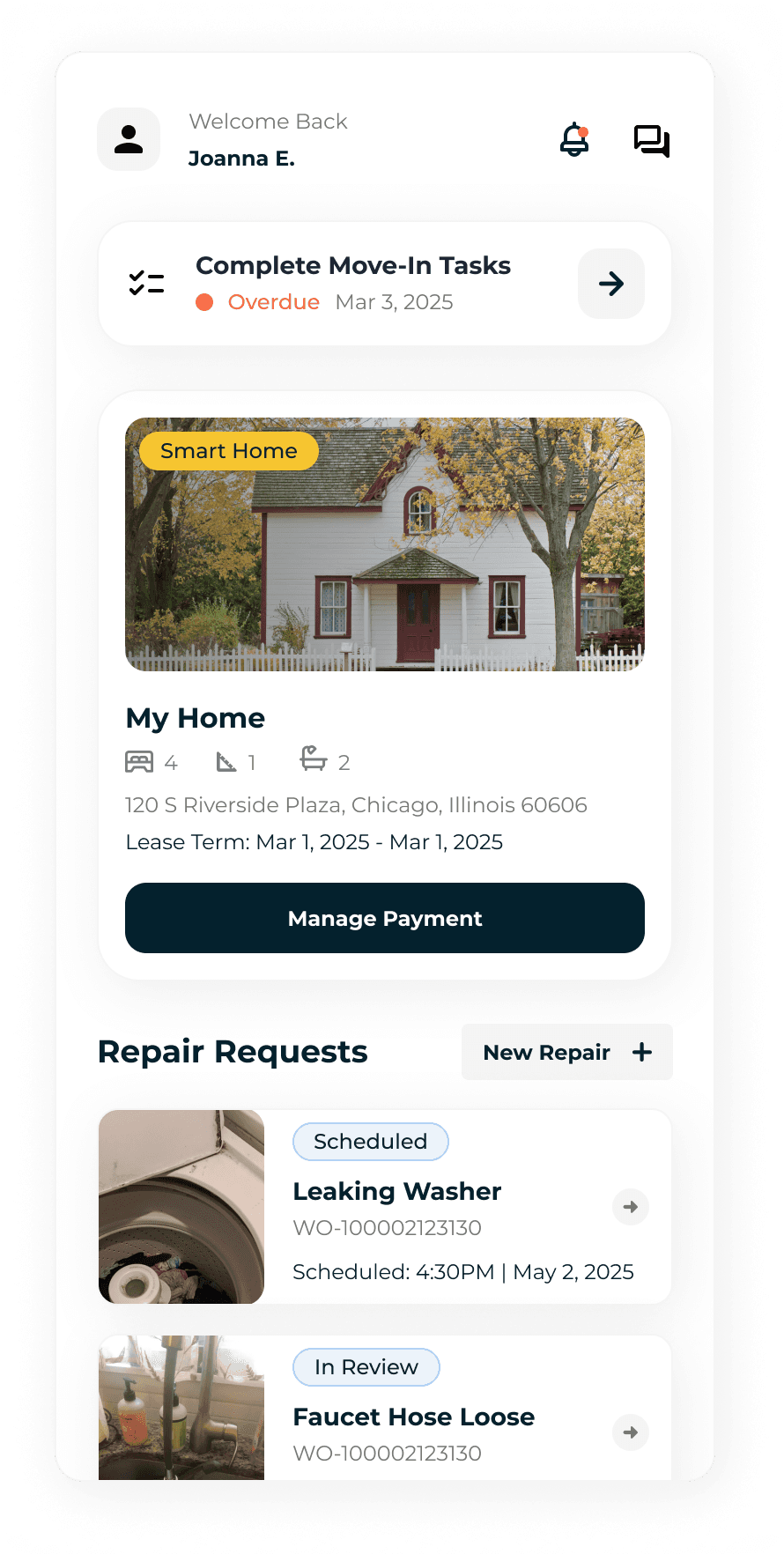
Phase 1: Payment, Lease, and Work-Order Pages Were the Biggest Offenders
Phase 1 involved identifying the most utilized flows, and surfacing them more clearly. These flows were:
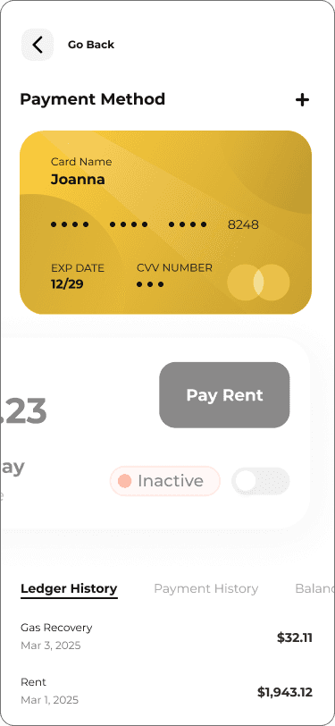
Payment (New AutoPay Feature)
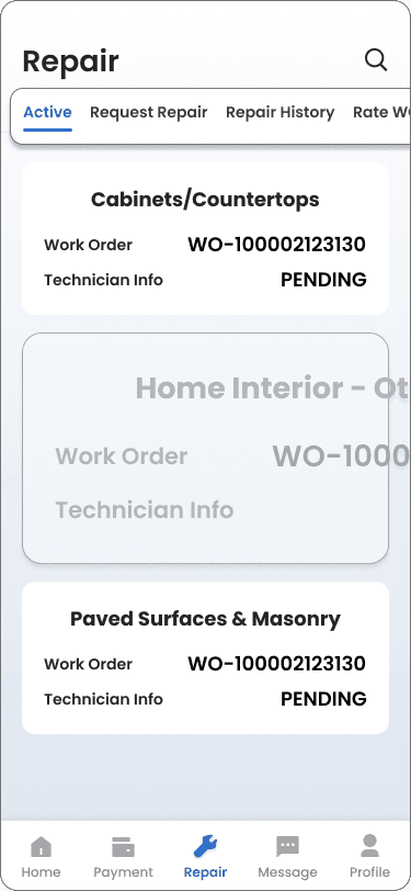
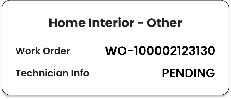
Work Order (Live Tracking + Visual Hierarchy)
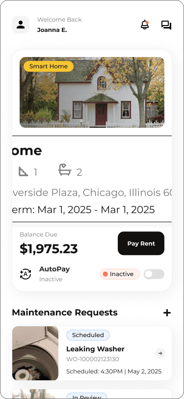
Lease Information + Homepage (Information Architecture)
I implemented live tracking on work order statuses as well as reorganizing the bottom nav to better align with user habits and business needs. I also added auto pay to ensure consistent monthly on-time rent payments.


Old Payment UI

New Payment UI
Old Maintenance UI


New Maintenance UI


Old Lease UI


New Lease UI
04. Good but not Good Enough
Phase 2: From Increasing Usability to Increasing Profits
Phase 1 reduced call volume by 11% in the first month of launch and increased app store rating to 4.2 stars. However, there was an opportunity to still make the app more valuable.

05. An Evolving Demographic Requires Evolving Technology
Leveraging BeHome 247 Smart Home
Strengthening the partnership with BeHome247 helped us to not only unlock higher rent premiums, but also address an important UX opportunity: differentiating our rentals offering.
Remote home control is a differentiator, especially in metro markets
Residents logged in only ~2x/month, mostly for rent or maintenance
Low app engagement were still persistent pain points

06. Balancing User Experience and Business Needs
Initial Smart Home Integration Pitch
The smart home integration wasn’t just about integrating BeHome 247 features. It was about repositioning the app from a transactional tool to a lifestyle companion.
My initial pitch involved showing a truly immersive experience in the form of diegetic 3d designs. However, the cost to implement from a technical perspective was too high and it was impossible to account for all the different layouts of homes in our portfolio.
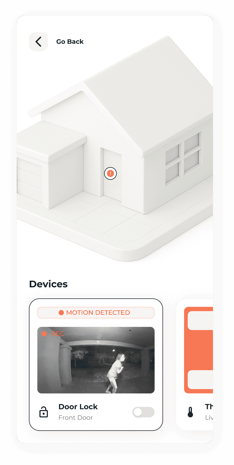
1st Smart Home Pitch Mock Ups (3D)

1st Smart Home Pitch Mock Ups (3D)
07. Achieving a Better Balance
Second Attempt at the Pitch
I moved onto a dual tab, tile based UI, assuming it would offer users an organized way to manage devices separate from the monitoring features.
Devices were laid in clusters
Each device had a separate monitoring tab with more features
Each device had a single function available on the right hand side
(Ex. Doors only having a lock/unlock toggle)
Could be easily scalable when adding more devices
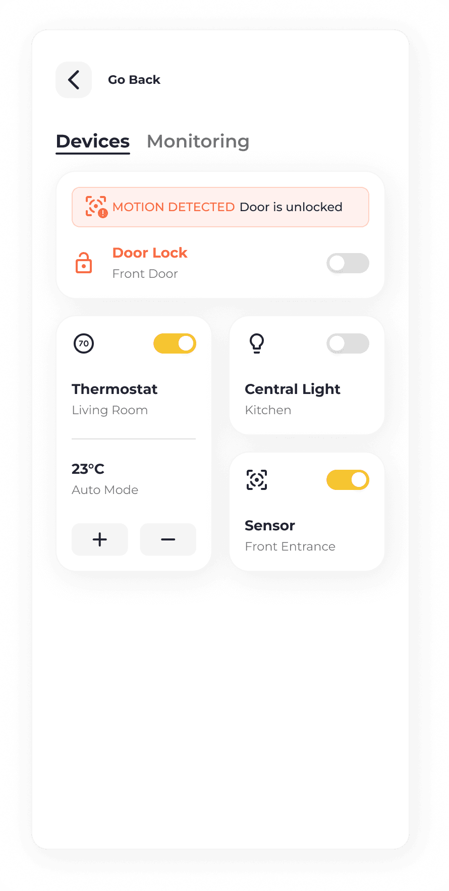
2nd Smart Home Pitch Mock Ups (Tiles)

2nd Smart Home Pitch Mock Ups (Tiles)
08. Listening to our Residents
The Shortcomings of Oversimplification
While the original designs worked well in theory, during usability testing, I noticed users point out several shortcomings
Didn’t Align with User Expectations
Users couldn't monitor and operate smart devices on one page.
Low Customization, High Friction
Users couldn’t prioritize devices and key actions were hard to reach.
Lacked Visual Clarity and Personality
Flat visuals and generic listings made the app feel lifeless.
Despite being functional, the 2nd pitch made the app feel more like a clunky control panel than a home companion.

09. UX Design = Reiteration
Third Try: A Single Page, Consolidated UI
User tests led to a single page, tile-based UI with dynamic, tappable cards that surfaced key info users cared about more than expected.
The consolidated cards let users adjust key settings, monitoring and operation, directly on one page
Devices could be filtered by floors allowing quicker navigation to their desired devices
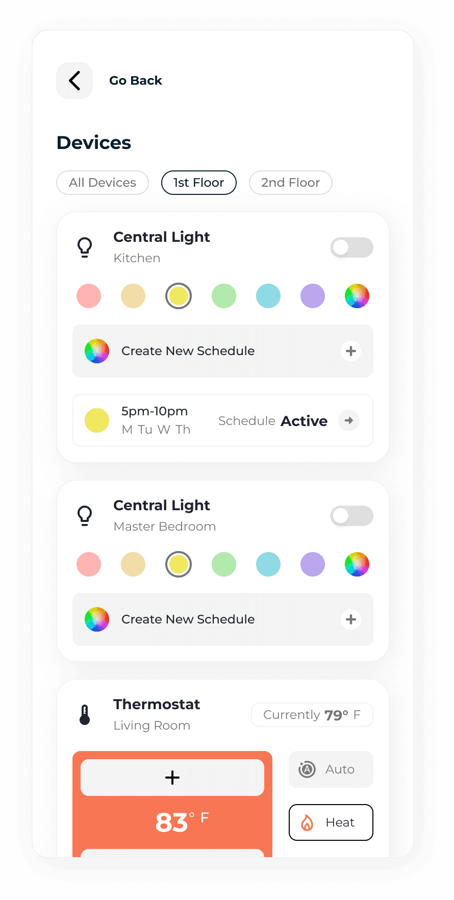
Final Smart Home Pitch Mock Ups (Consolidated)
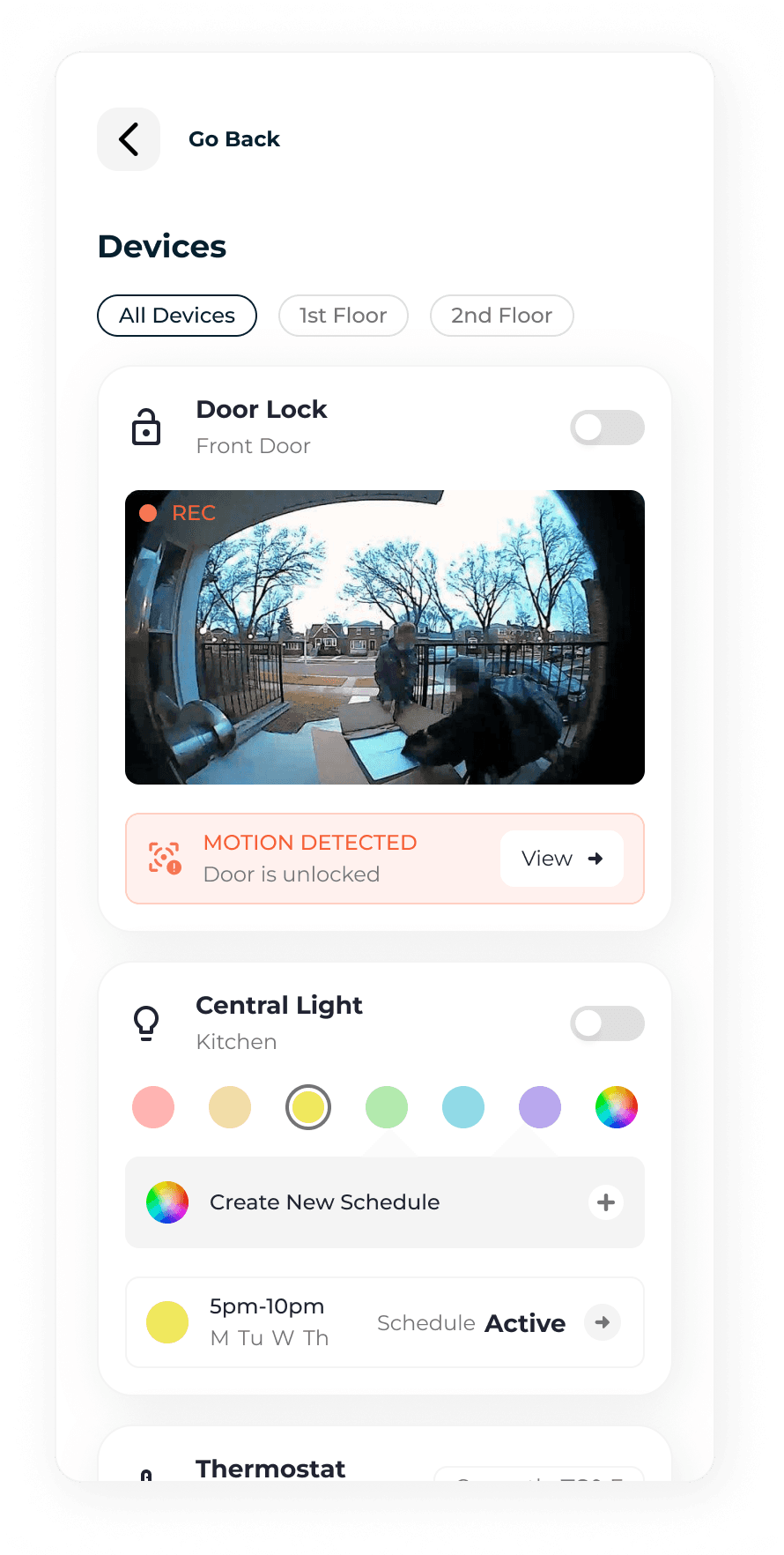
Final Smart Home Pitch Mock Ups (Consolidated)
10. Striking Gold
The Result of Shipping Phase 2
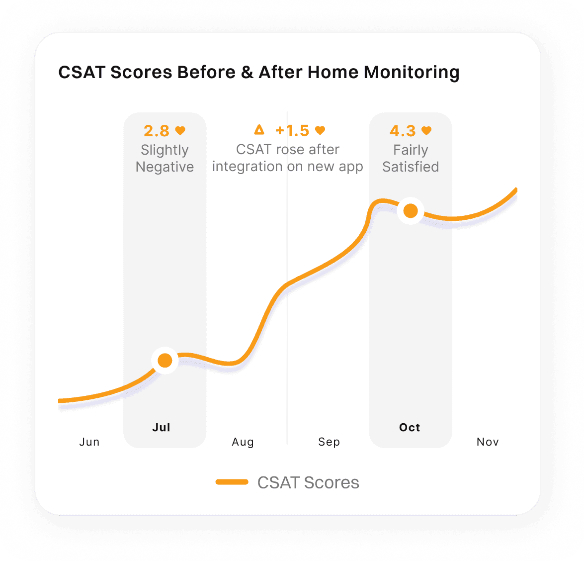
The integration turned the app into a modern smart home hub with real-time states and intuitive controls. Users called it “clear,” “modern,” and “intuitive,” boosting profits while helping Pathlight stand out amongst its competitors
Increased rent premiums 13.2%
Increased CSAT scores 53.6% on resident app
Enabled keyless entry for maintenance during home turnovers

11. First Impressions Matter
Phase 3: Making Residents' Lives Easier
Once we got residents settled in, we faced move-in challenges.
Scattered tasks across four channels caused confusion and delays
Only 40% completed tasks on time, leading to security deposit disputes
There was no central hub for this entire process

Simpler is Usually Better
Digitize the Move-In Experience
I opted for a digital checklist, which offered a sense of urgency, immediate satisfaction through task completion, and required minimal development effort.
I built a new “Move-In Tasks Section” which included guided flows for:
Paying the security deposit online
Completing the Move In Condition Form (MICF)
Acknowledging HOA responsibilities
Transferring gas and electricity in the residents name
Move-In Checklist Mock Ups

Move-In Checklist Mock Ups
13. Systemizing Success
The Move-In Checklist Was a Success
68% of the first 100 families completed all tasks on time, up from our previous 49% average. Using the same framework, we introduced a new flow called the "Pre Move-In Tasks" to encourage even earlier task completion.
By presenting these tasks before the stressful "Move-In" period, I was able to:
Boost the completion rate of the MICF by 89%
Decrease late fees
Receive security deposit payments in a timely manner
- New Resident in Mesa, AZ
14. Providing Value to Residents and Pathlight
The Impact of My Work on the Company
The three phases of the redesign delivered on our company's slogan G.R.E.E.T. (Great Resident Experience Every Time) through measurable improvements across usability, operational efficiency, and resident satisfaction.
Pathlight’s resident app evolved from a stopgap tool to a strategic platform, driving both resident retention and business growth.


